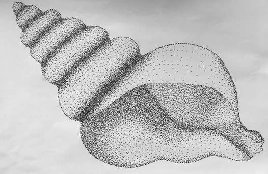
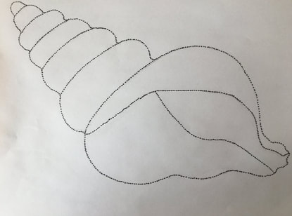
Finished Stippling Drawing
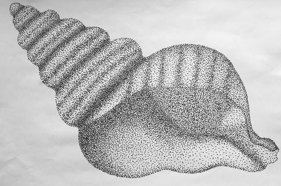
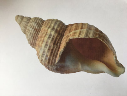
For my stippling drawing, I chose to draw a seashell. I wanted to draw a seashell because I thought that it would be very simple, yet look very accurate in terms of value. First I drew a dotted outline out of the seashell. Then, I outlined each part of the seashell with dots, and started filling the seashell in. I looked at the value of the seashell in the picture and tried to copy that same value range onto my drawing. I am proud of my drawing because I think it turned out looking good. I think it looks pretty accurate to the picture and I was able to get a smilier value scale from the picture to the drawing.
Stippling
Week 6
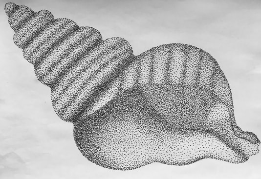
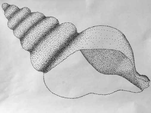
This week I have been focusing on trying to make the shading look more accurate. I know it looks like I haven't don't much but I have been trying to be very meticulous with where I put dots on the drawing. I have been trying to slowly darken the inside parts of the shell. I have also been working on a painting for my mom for Mother's Day this week and doing a lot of photography with a new camera I recently bought.
Week 5
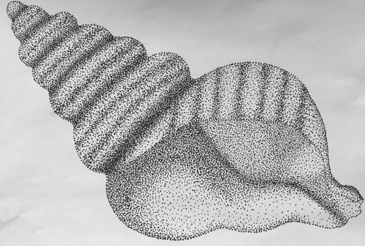
This week I have been adding more depth and value to my seashell drawing. I have been working on adding all of the little lines in the seashell as well. I have also been working on other personal art projects.
Week 4
This week I have been working more on filling in my seashell and focusing on the value in the picture. I have been working on the lower part of the seashell and trying to match the value as best as I can. I have also been working in my journal doing collages, drawings, and paintings.
Week 3
This week I have been working on filling in more space on my seashell drawing. I have been darkening it more and starting to fill in the rest of it. I have also been working on art by doing some collages and practicing drawing random things in my journal this week.
Week 2
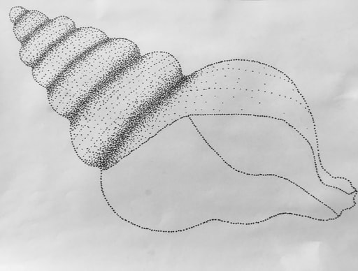
This week I have been working on my drawing. I started stippling by filling in each shaded spot, and then I went over it multiple times to darken it while referencing the picture to see where the most-least shaded spots were.
Week 1
Process |
|
At the beginning of the week, I went on a walk and took some pictures of things up close, but none of them turned out very well, so I then found this close up picture of a seashell. First, I sketched it out, and once I was done with my sketch, I started stippling by outlining the seashell.
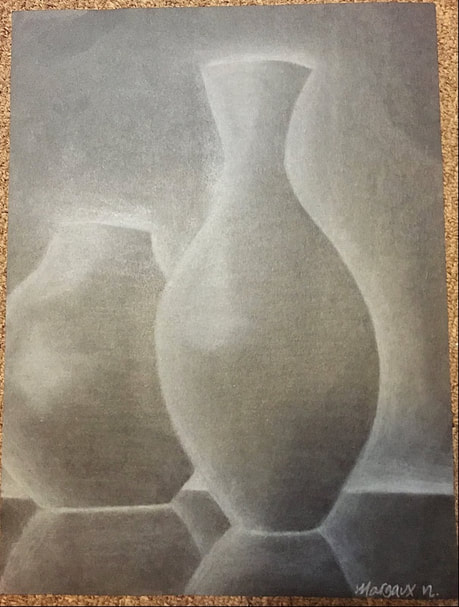
Charcoal Value Drawing
Margaux Newby
Vases, 2019
8.5" x 11"
White charcoal on black paper, blending stick, kneaded eraser
Vases, 2019
8.5" x 11"
White charcoal on black paper, blending stick, kneaded eraser
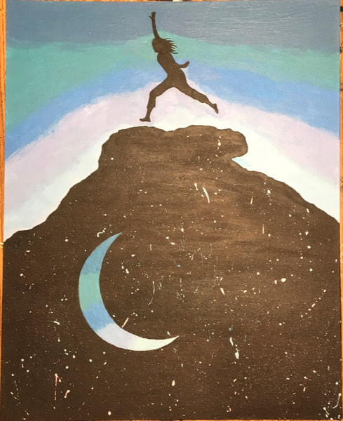
Choice Based Art Project
Margaux Newby
Leaping into the Unknown, 2019
16" x 20"
Paint on canvas
This painting was inspired by a photograph of me on a rock in the Utah desert. I wanted to paint this picture because the picture shows deep contrast between the sky, the rock, and me jumping. The picture is a very inspirational picture in my opinion because of the obvious negative and positive space, which I was able to show well in my painting. I chose to use paint because it would show the bright colors and deep contrast well. Painting is also good for intricate work, so it worked well for the moon, and the person jumping. My favorite part about my art is the contrast and connection of the moon and the person jumping, because the moon is the color of the sunset behind the person jumping, and the person jumping is the same color as the space behind the moon, which makes the whole painting balanced. I think my painting sends the message of letting go of your thoughts and stress and jumping into the unknown of taking risks.
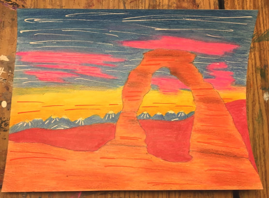
Watercolor Project
Margaux Newby
Delicate Arch Sunset, 2019
9" x 12"
Watercolor pencil on paper & paint pen
Delicate Arch Sunset, 2019
9" x 12"
Watercolor pencil on paper & paint pen
Margaux Newby
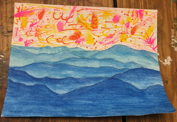
Deep Hills, 2019
9" x 12"
Watercolor pencil on paper & paint pen
Deep Hills, 2019
9" x 12"
Watercolor pencil on paper & paint pen
Oil Pastel Project
Margaux Newby
Peach Zentangle, 2019
9" x 9"
Oil Pastel and Thin Sharpie
Peach Zentangle, 2019
9" x 9"
Oil Pastel and Thin Sharpie
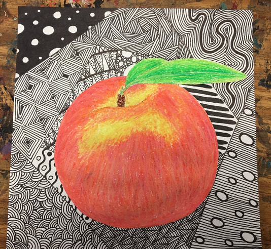
Reflection Paragraph:
I am proud of this piece of art because I feel like the peach looks realistic and turned out well when I blended many colors. The look of the peach on the zentangle is very aesthetic because the peach pops out from the zentangle and the zentangle is very detailed and gives contrast against the peach because of the lack of color against the bright color. For the process I used to create this piece of art, I drew the peach on a separate sheet of paper with multiple colors to blend. Then, I drew the zentangle and cut out the peach to glue on the zentangle.
